A Supplementary plots
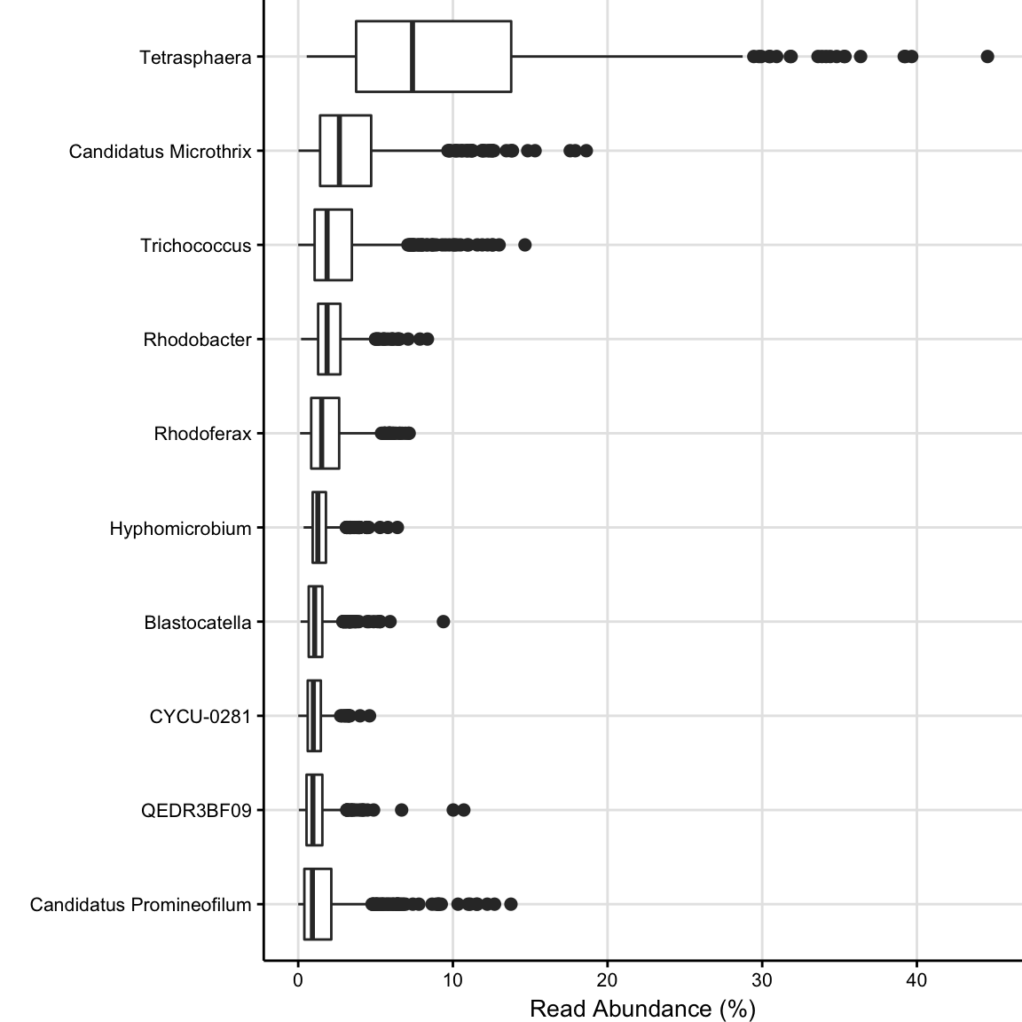
Figure A.1: Boxplot of the 10 most frequent Genera in all samples (ordered by median). No filtering nor transformation has been used.
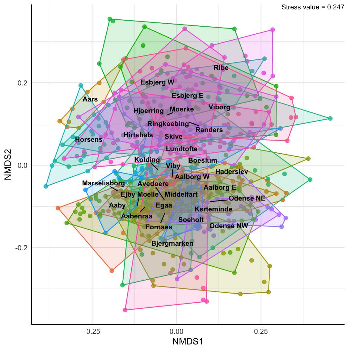
Figure A.2: non-Metric Multidimensional Scaling, Bray-Curtis Dissimilarities. No Transformation.

Figure A.3: Principal Coordinates Analysis using the Jensen-Shannon Divergence dissimilarity measure. No transformation.
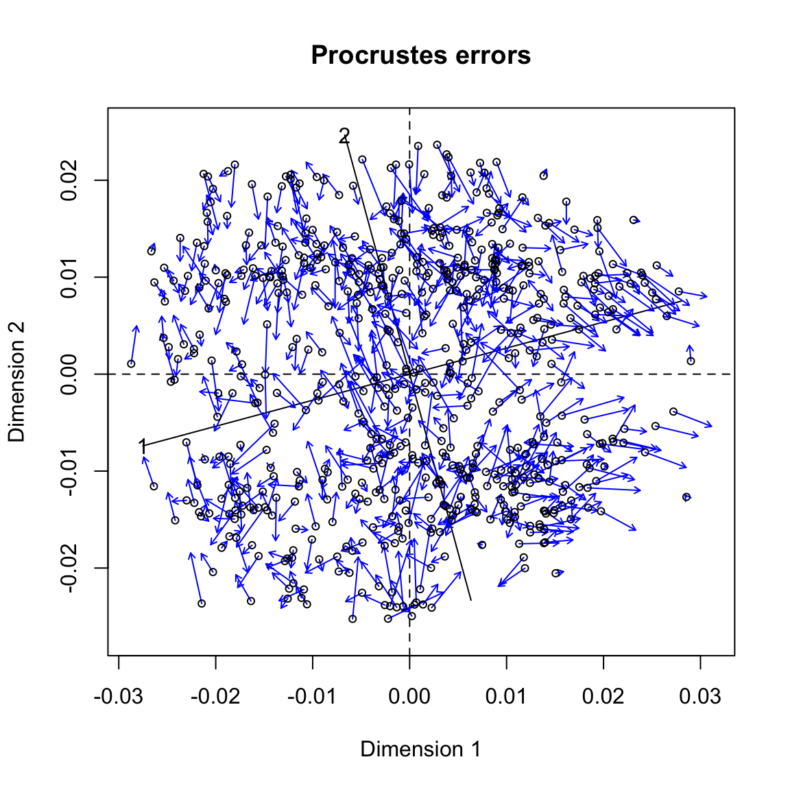
Figure A.4: Procrustes analysis of the ordination results from Figure 4.1 and Figure 4.2. Procrustes sum of squares: 0.80. The blue arrows indicate the differences in the relative positions of the same samples in both figures.
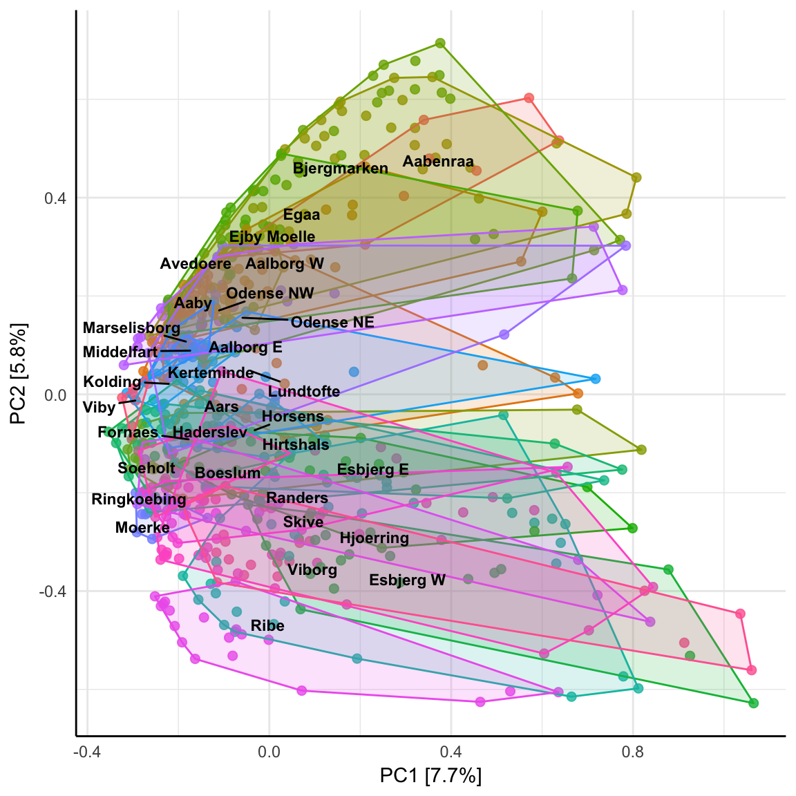
Figure A.5: Principal Components Analysis where all positive abundances in the raw count data have been set to 1. Species with abundances <0.1% are removed beforehand.
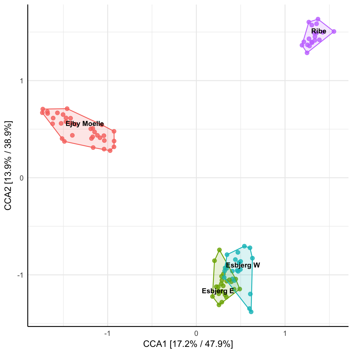
Figure A.6: Canonical Correspondence Analysis of samples from 4 of the WWTPs. Hellinger transformed.
Figure A.7: Canonical Correspondence Analysis of all samples from 2013. Hellinger transformed.
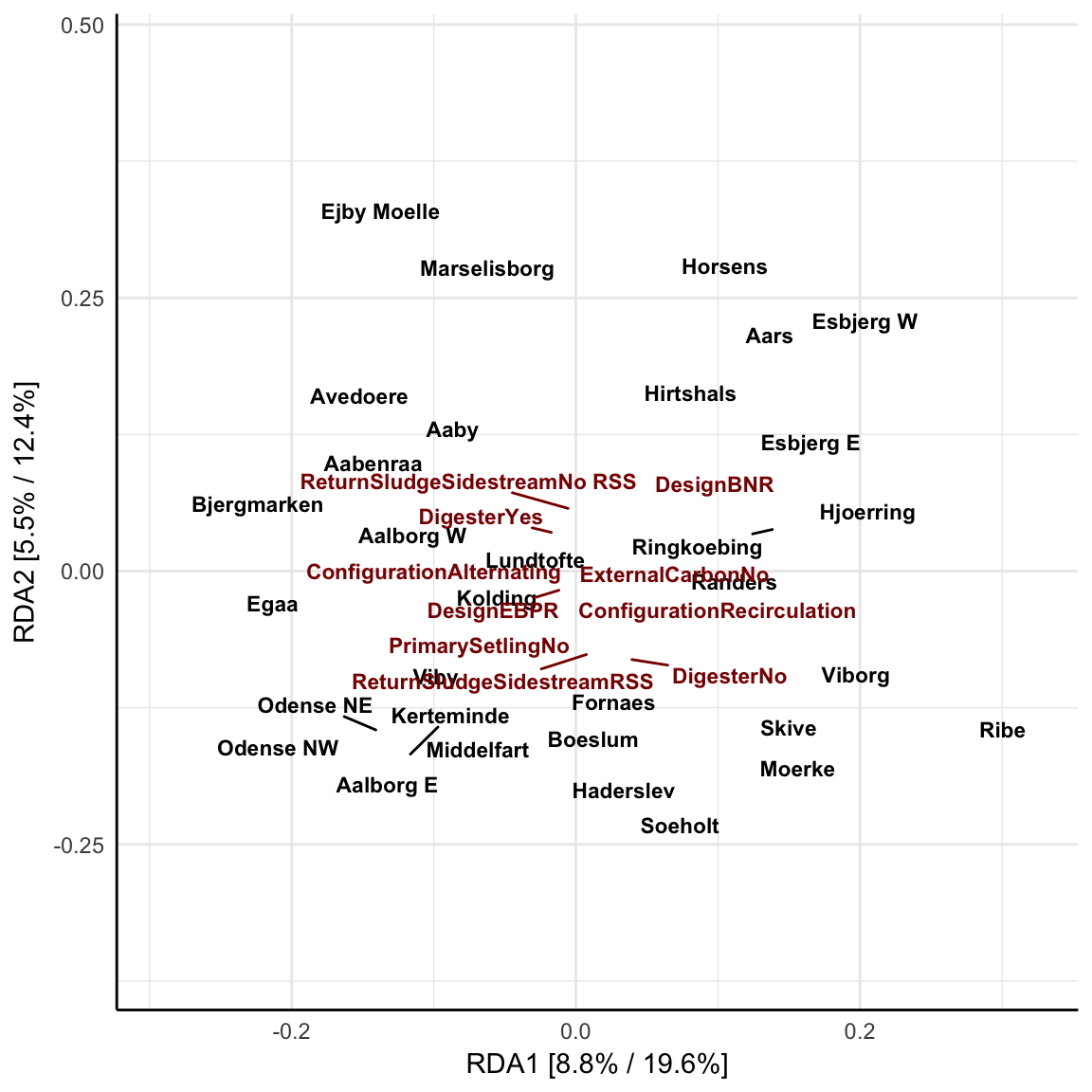
Figure A.8: Redundancy Analysis biplot with all possible plant design parameters plotted in red. Constrained to WWTP.
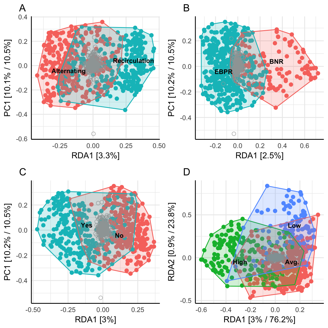
Figure A.9: Redundancy Analysis with the constraints (A): Alternation vs Recirculation, (B): Enhanced Biological Phosphorous Removal (EBPR) vs Biological Nutrient Removal (BNR), (C): Primary Setling, and (D): the amount of industrial wastewater, where Low is 5%<10%, Avg. is 10%<35% and High is 35%<100%.
Figure A.10: Canonical Correspondence Analysis constrained to which year the samples were taken, except the year 2014. The different years are marked with a label at the centroid of the corresponding samples and colored according to the legend.