4 Exploring the Microbial Communities of the WWTPs
In this chapter the WWTPs will be described using mainly exploratory/unconstrained ordination methods to get an overview of the differences between the WWTPs with respect to their microbial communities. In Chapter 5 these differences will be explained using also the explanatory/constrained ordination methods based on information about the WWTPs and how they are designed. The differences are represented by the distances between sample points if not noted otherwise. The points are colored by a unique color for each WWTP, but because there are 32 different WWTPs it can be difficult to distinguish between the colors and the corresponding name of the WWTPs are therefore written at the approximate center of all the sample points from the particular WWTP. The same colors listed in the legend in Figure 4.1 will be used in subsequent ordination plots in the chapter. Furthermore, the eigenvalues of the axes plotted are indicated by the axis titles as a percentage of the total sum of eigenvalues, and scree plots can be found in Appendix B.
Before filtering, the 622 samples from 32 Wastewater Treatment Plants (WWTPs) contained a total of 21728 different OTUs. After filtering the low abundant OTUs the size of the data reduced remarkably with a total of 2366 different OTUs in all the samples (mean per sample: 1078, SD: 291.7). Because this is still a very large amount of data to visualise (even when using ordination), the following plots may be better viewed in the online bookdown version of this report, where it is possible to zoom in the plots and hover the points. It is available at https://github.com/KasperSkytte/MasterThesis. If you encounter any problems or need help, please email me at ksan12@student.aau.dk
4.1 Overview of the differences
The 622 samples were initially analysed using Principal Components Analysis to provide a brief overview of the data (Figure 4.1). At a first glance, there seem to be many similarities between the WWTPs, as the groups of samples tend to overlap. However, it is possible to identify global clusters of WWTPs, which seem to be similar at least partly. The largest dissimilarities observed in an ordination plot are points positioned diagonally of one another (when there is large variation on both axes), which is the case with for example the Ribe and Bjergmarken WWTPs. Now, imagine a line from the Ribe label towards the Bjergmarken label. Two clusters of similar WWTPs can then be identified by separating the line with a perpendicular line roughly in the direction of Fornaes-Haderslev, where the WWTPs on either side of this perpendicular line can be considered two different clusters. Of course, this is a rough clustering of the WWTPs, but along the Ribe-Bjergmarken diagonal seems to be the greatest variation between the WWTPs. Large variation between the samples within individual WWTPs can also be observed, for example within Bjergmarken, whose samples cover a broad area of the top group of WWTPs. This is the case with many of the WWTPs and these differences are mostly evident on the first axis. It is worth noting that the eigenvalues of the two axes plotted are nearly identical (10.1% vs 9.2%), which further highlights that the differences between the samples are large within the individual WWTPs. If there would have been a clear difference between the WWTPs, they would have been positioned horisontally with few overlaps, the first axis would have had a much greater eigenvalue than the second axis, and the within-group variation would have been evident mostly on the second axis.
Figure 4.1: Principal Components Analysis of samples from the 32 WWTPs. Each WWTP has been assigned a unique color as indicated by the legend and labels have been positioned approximately at the center of the points.
With PCA the read abundances of the OTUs (aka the weights) contribute considerably to the distances between the samples (Buttigieg & Ramette, 2014). To represent the differences between the WWTPs where the OTU abundances have less of an impact on the distances, the widely used Bray-Curtis Dissimilarity index (BCD) is appropriate. With this measure the abundances have less of an impact because the abundance of an OTU is relativised to the total abundance of the OTU in the two samples being compared. As BCD is a semi-metric (does not satisfy the triangle inequality property), Principal Coordinates Analysis (PCoA) has to be used and the result can be seen in Figure 4.2. The relative positions of the sample points on the axes are not always in the same orientation between different ordination methods and reversing the first axis (mirroring the plot vertically) reveals relative positions similar to those in the PCA (Figure 4.1, see Figure A.4 in Appendix A for a procrustes comparison). Again, the groups are overlapping and are not well separated on the first axis, but there is a slightly clearer separation of the two (top and bottom) groups observed with PCA (Figure 4.1). The fact that the read abundances contribute less to the distances when using the BCD index and the result is similar to that of PCA indicates that abundances are not the primary cause of the differences and that the WWTPs may have many OTUs in common. The eigenvalues of the axes are not ideal, however, and using non-Metric Multidimensional Scaling with the BCD index had a bad stress value of 0.247 (see Appendix A, Figure A.2), which confirms that all the variation in the data cannot be fully represented in two dimensions.
Figure 4.2: Principal Coordinates Analysis of samples from the 32 WWTPs using the Bray-Curtis Dissimilarity (BCD) index, with no Hellinger transformation. Each WWTP has been assigned a unique color as indicated by the legend in Figure 4.1 and labels have been positioned approximately at the center of the points.
As mentioned in Chapter 2, microorganisms are most likely present when a set of optimal environmental conditions are met at the sampling site resulting in a unimodal abundance distribution across samples. The ecological differences between the WWTPs are therefore expected to be reflected by both unique bacteria and to a lesser extend abundances of shared bacteria. To compare the WWTPs more in terms of their distribution of OTUs, the Pearson \(\chi^2\)-statistic used in Canonical Correspondence Analysis (CCA) is more appropriate than the measures of PCA and PCoA (with BCD), as it better reveals the unique OTUs that would correspond to each WWTP. As seen in Figure 4.3, CCA shows that Esbjerg E, Esbjerg W and Ribe seem to be significantly different from the rest of the WWTPs. In general the sizes of the groups are smaller, more distinct and the overlaps are less prevailing. Furthermore, the axes plotted span a much larger range (roughly from -4 to 2) than those in PCA and PCoA (roughly from -0.3 to 0.3). When interpreting a CCA plot it is important to note that the sample points positioned closest to the center of the plot (0,0) have the highest probabilty of containing the most common OTUs across all samples and the samples closer to the edges of the plot have a higher probability of containing unique OTUs. This means that the Esbjerg E+W and Ribe WWTPs must either contain several unique OTUs which the rest of the WWTPs are highly unlikely to contain, or the opposite, common OTUs in the other WWTPs are of low abundance in these 3 WWTPs (this will be investigated in the following Chapter 4.2). Except for these 3 WWTPs, the overall groupings of WWTPs observed with PCA and PCoA are also evident with CCA. Considering only the relative positions of the text labels, the differences between the WWTPs seem to be relatively similar to that observed with PCA and PCoA, but now on the primary axis. It can be difficult to see in the figure, but other than the Esbjerg E+W and Ribe WWTPs, there are a few additional WWTPs that are (almost) not overlapping with other WWTPs, namely Lundtofte, Marselisborg and Moerke, indicating that their distribution of OTUs are slightly different from the rest of the WWTPs. They are closer to the center, however, indicating that the differences are most likely due to differences in abundances of common OTUs and not due to unique OTUs.
Figure 4.3: Canonical Correspondence Analysis of samples from the 32 WWTPs constrained to the WWTP where samples were taken. Each WWTP has been assigned a unique color as indicated by the legend in Figure 4.1 and labels have been positioned approximately at the center of the points. The percentages indicated on the axis titles are (left): the eigenvalue of the axis relative to the total sum of eigenvalues and (right): the eigenvalue relative to the total sum of only the constrained eigenvalues.
Again, the eigenvalues of the axes are low, but this is expected since the WWTPs must have many OTUs in common considering the fact that there are an average of 1078 different OTUs in each sample, and only 2366 different OTUs in all the 622 samples.
4.2 How does the microbial community composition describe the WWTPs?
Describing the differences between the WWTPs with respect to their microbial communities is not an easy task. As the differences are the result of variation in the presences and/or abundances of 2366 different OTUs, it is impossible to provide an extensive overview while covering all aspects of the differences. The heatmap shown in Figure 4.4 is a good example of the challenge of visualising the complex microbial communities characteristic of the individual WWTPs. The most abundant OTUs are often of most interest, however. The heatmap shows an overview of the 40 most abundant genera in all samples. Noticably, there seem to be only a few genera in high abundance in almost all the WWTPs, namely Tetrasphaera, Candidatus Microthrix, Trichococcus, Rhodobacter, Rhodoferax (the top 5). These 5 genera (65 OTUs) together made up roughly 20% of the total number of reads. Specifically Tetrasphaera is the only genus abundant in all WWTPs while other genera are (at least nearly) absent in at least one of the WWTPs. It is also clear that there are several genera which are only abundant (>5%) in one or only a few WWTPs, for example Gordonia at the very bottom of the figure, which is mostly only abundant in Moerke. These somewhat ‘unique’ genera abundant in only one WWTP are numerous and are often only abundant in one or a few samples, usually from the same WWTP. Generally, the remaining 324 of the 364 identified genera which are not shown in Figure 4.4 are dominant in only one and occasionally a few samples, which could be simply due to differences in the influent. Depending on the ordination method used to represent the differences between the WWTPs, these unique OTUs will either have
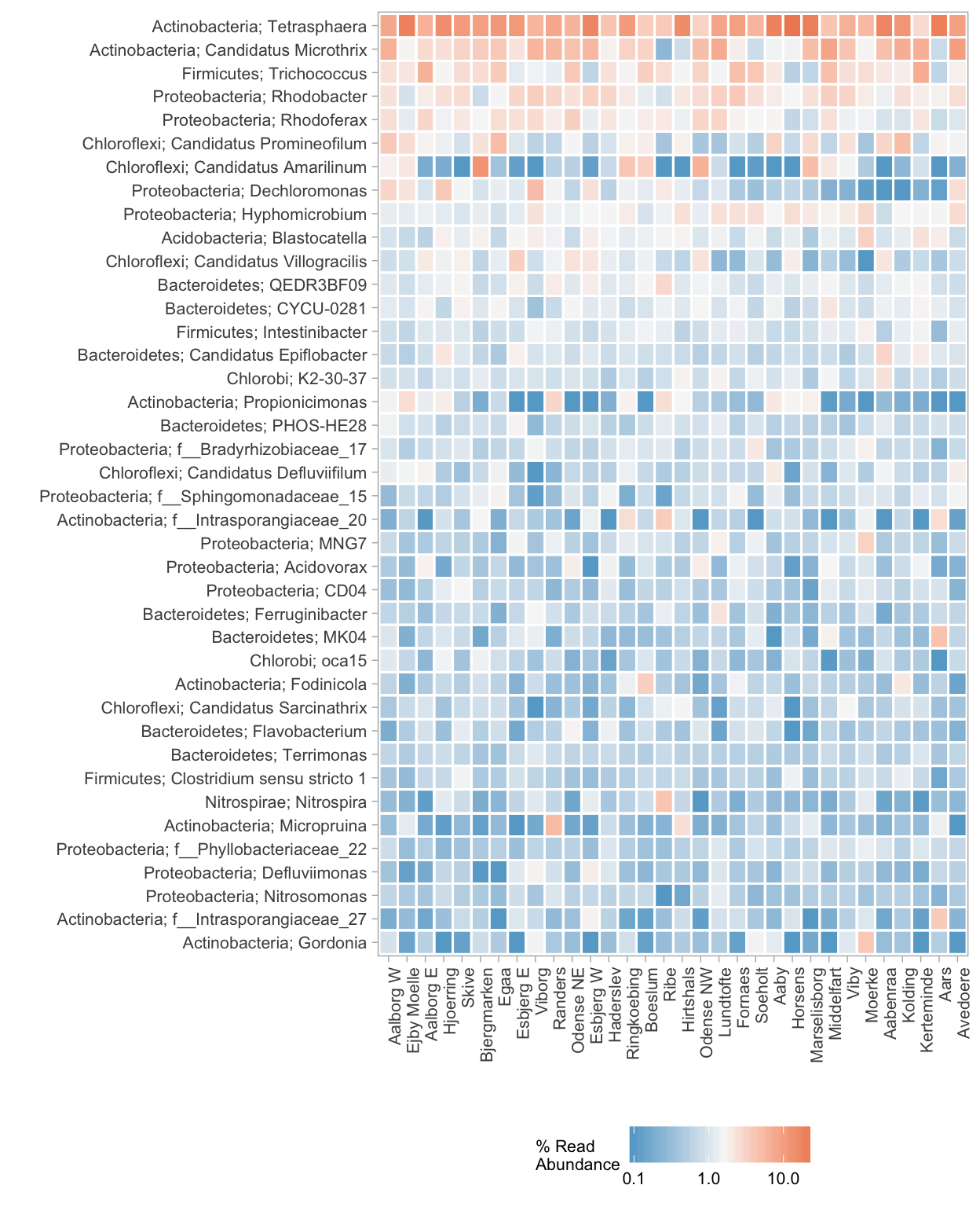
Figure 4.4: A heatmap of the 40 most abundant genera in all the samples grouped by the average in each WWTP. The WWTPs are ordered by similarity. The relative abundances are indicated by a color gradient according to the legend. The corresponding phylum of each genus is written to the left of the semi-colon: ‘phylum; genus’. OTUs which have not been classified to a genus are indicated with the family name instead (the prefix ’f__’)
a large impact on the distances calculated, as with Correspondence Analysis, or almost no impact at all, as with PCA, where variation in the abundances of the most abundant OTUs across all samples will have the largest influence on the distances. This is evident in the fact that the most abundant OTUs across all samples also seem to be among the 20 most extreme OTUs in a PCA biplot (Figure 4.5(A)). This is one of the characteristics of PCA - it shows a more quantitative-like representation of the data, because the distances are weighted directly by read abundances (Buttigieg & Ramette, 2014). To interpret the differences between samples with respect to their species in a PCA biplot, the species points are normally plotted as an arrow outwards from the center (0,0). This, as well as the plotting of sample points, has been omitted for clarity.
Because the groups of samples from the individual WWTPs do not form distinct groups in PCA (Figure 4.1), it is also expected to be reflected in the positions of the OTUs. It is clear that Tetrasphaera is the predominant genus and seems to be the most abundant genus across all the samples, because it is positioned in the far left, lower corner (coordinates: (-0.53,-0.17)), but it does not explain the clusters of WWTPs alone. The remaining OTUs points are positioned closer to the WWTPs, which confirms that the differences between the WWTPs can be explained partly by differences in the read abundances of common OTUs. The WWTPs near the top of the plot can then be characterised by having a higher abundance of Trichococcus, Candidatus Defluviifilum, and more, as opposed to the WWTPs near the bottom, which have a higher abundance of for example Rhodobacter and Defluviimonas. There seem to be no unique and highly abundant OTUs, which could have been characteristic of individual WWTPs or groups of WWTPs. This is expected, since the samples seem to share many OTUs that are generally abundant and since there are no clearly separate groups of samples observed with PCA. Noticably, the positions of the OTUs observed with PCA do not appear to be completely representative when compared to the actual read abundances of the OTUs in each WWTP (Figure 4.5(B)).
Sorry, no heatmap here in the bookdown version of the report.
Figure 4.5: (A): Principal Components Analysis of samples from the 32 WWTPs. The names of the lowest known taxonomic rank of the 20 most extreme OTUs are shown in red text, where g__ is genus name, f__ is Family name, etc. This figure is identical to Figure 4.1, except that OTUs are plotted instead of samples. (B): Heatmap of the mean read abundances of the same 20 OTUs in each WWTP. The corresponding phylum and genus names of the OTUs (the numbers) are also indicated in the form: phylum; genus; OTU.
For example, Rhodobacter seems to have a larger influence on Randers than Micropruina, even though Micropruina is considerably more abundant in Randers compared to Rhodobacter. This phenomena is believed to be caused by the fact that only the centroids (labels) of the WWTPs are being interpreted and not all samples at once, however.
It is also clear that low abundant and unique OTUs have almost no contribution to the distances in PCA, because they are positioned very close to the center (this is only visible in the bookdown version of the report, there are too many labels to plot). This somewhat qualitative information can be valuable, but is lost with PCA. As mentioned, CCA reveals these OTUs clearly, even when given lower weights. The relative positions of OTU points in CCA are not to be interpreted as linear gradients of abundances as with PCA, but as probabilities of the OTUs to be present in the samples positioned nearby. It is impossible to show text labels of the OTUs with CCA, so again, please refer to the bookdown version of the report for their identity.
A CCA biplot (Figure 4.6) shows that there are numerous OTUs which seem unique to Esbjerg E+W and Ribe. It is clear that there are OTUs very close to the Ribe and Esbjerg E+W samples, but there are also OTUs positioned roughly on a gradient from the 3 individual WWTPs towards the center (0,0) of the plot. Because these OTUs are not exactly positioned among the samples from the 3 WWTPs, they may be present in low abundances in other samples from other WWTPs. Among the unique OTUs that are present in Ribe samples are for example from the genera Aquicella and Haliangium. Both of these genera are known halophilic bacteria which have previously been isolated from coastal saline waters (Fudou, Jojima, Iizuka, & Yamanaka, 2002; Valenzuela-Encinas et al., 2009). This could explain why they are present at the Ribe WWTP, because it is located near the west coast of Denmark and the influent water may have a higher degree of salinity. In the case of Esbjerg E+W, there is a much more diverse set of unique OTUs. These OTUs are not well defined as most of them have only been assigned to a family or higher taxonomic rank, which makes it difficult to explain their presence based on physiological properties. Some of the identified genera positioned the closest to Esbjerg E+W are for example Brooklawnia1, Herpetosiphon2, Thermovirga3, and Denitratisoma4. These will not be characterised further here, refer to the articles noted.
Figure 4.6: Canonical Correspondence Analysis of samples from the 32 WWTPs. This figure is identical to Figure 4.3, except that only the text labels of the WWTPs have been plotted and the OTUs are shown as grey circles (to better reveal overlaps). The percentages indicated on the axis titles are (left): the eigenvalue of the axis relative to the total sum of eigenvalues and (right): the eigenvalue relative to the total sum of only the constrained eigenvalues.
4.3 Concluding remarks
The 32 WWTPs generally seem to be similar with many OTUs in common, and the differences between the samples often seem to be large within individual WWTPs when using PCA and PCoA. The differences between the samples can either be thought of as qualitative differences, where a handful of unique OTUs are only present at one particular WWTP, or as quantitative differences, where the differences are primarily the result of variation in the read abundances of shared (usually also abundant) OTUs among the WWTPs. As such, there are differences in terms of both aspects and it is important to consider the ecological importance of both abundant OTUs and also the presence of unique OTUs and their abundances. Therefore it is reasonable to not only use one type of ordination and/or distance measure to represent the differences, but a combination of a few methods to reveal as many important aspects of the data as possible.